PIUR IMAGING ++ WEB DESIGN & CORPORATE IDENTITY
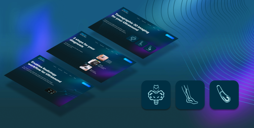
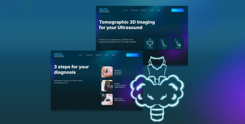
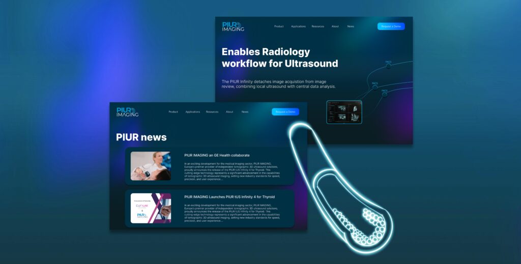
The objective was to redesign the website of PIUR, explaining their product as straightforward as possible. My role included creating an intuitive User Experience for medical professionals. The goal was to showcase the capabilities of PIUR (a tomographic 3D imaging solution). I aimed for a clear and cohesive design language without making the product boring.
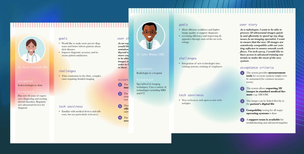
While researching for personas, I gained detailed insights into the challenges faced by medical professionals. For example how important the integration of such a complex technology is, into already existing workflows without disrupting efficiency and that the onboarding is fast and the product easy to understand. I also created a design family of icons (body parts) , wave-graphics and a color palette.
DISCOVER GERMANY ++ CHILDREN LEARNING APP
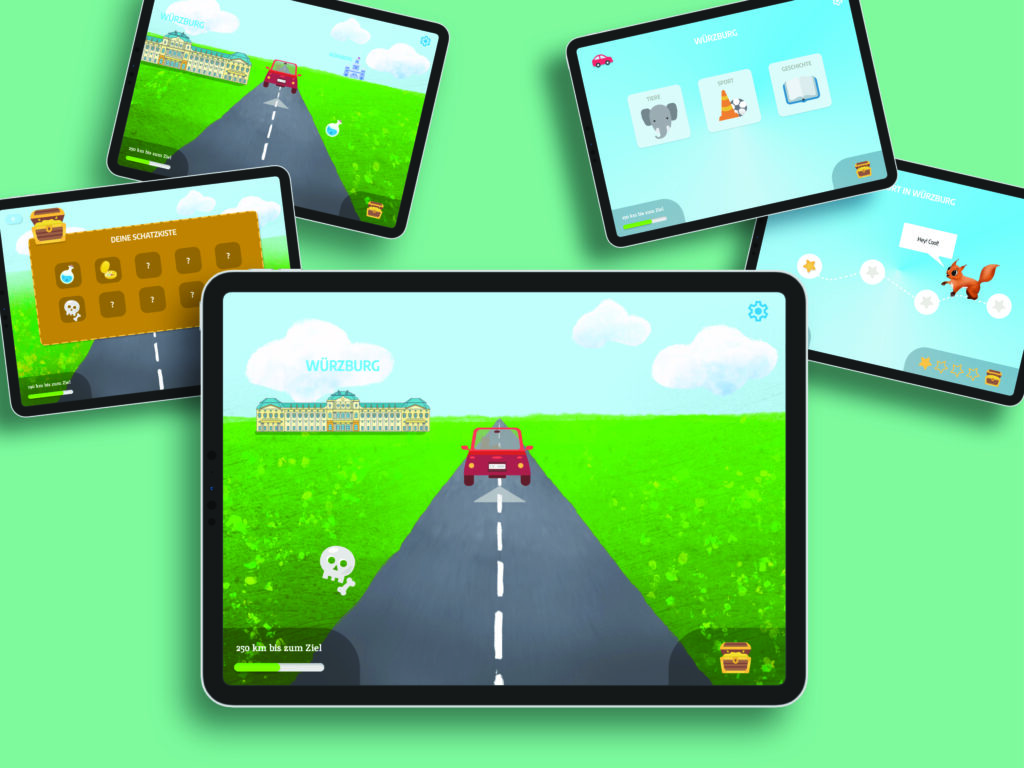
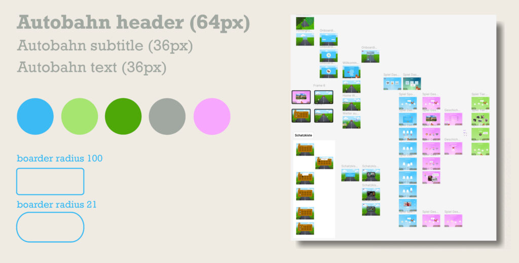
The goal of this project was to keep children engaged during car rides by encouraging them to observe their surroundings and discover landmarks across Germany.
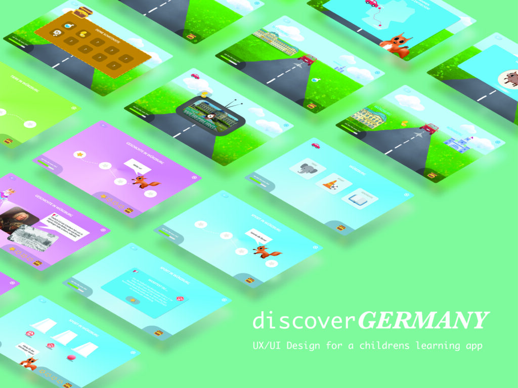
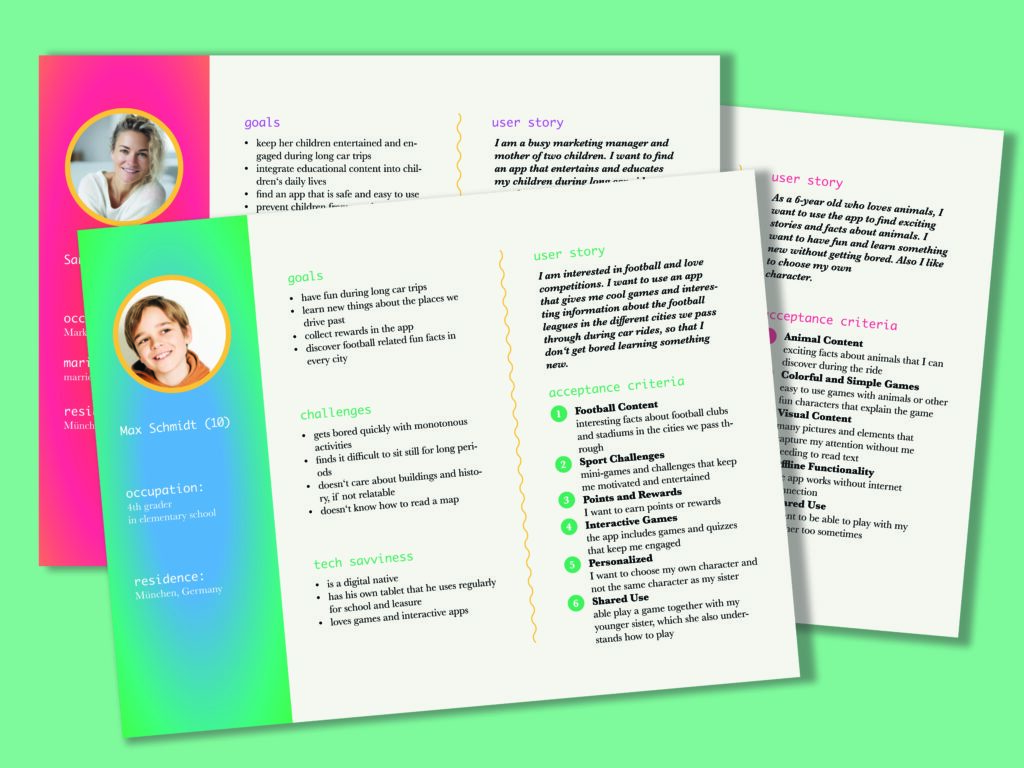
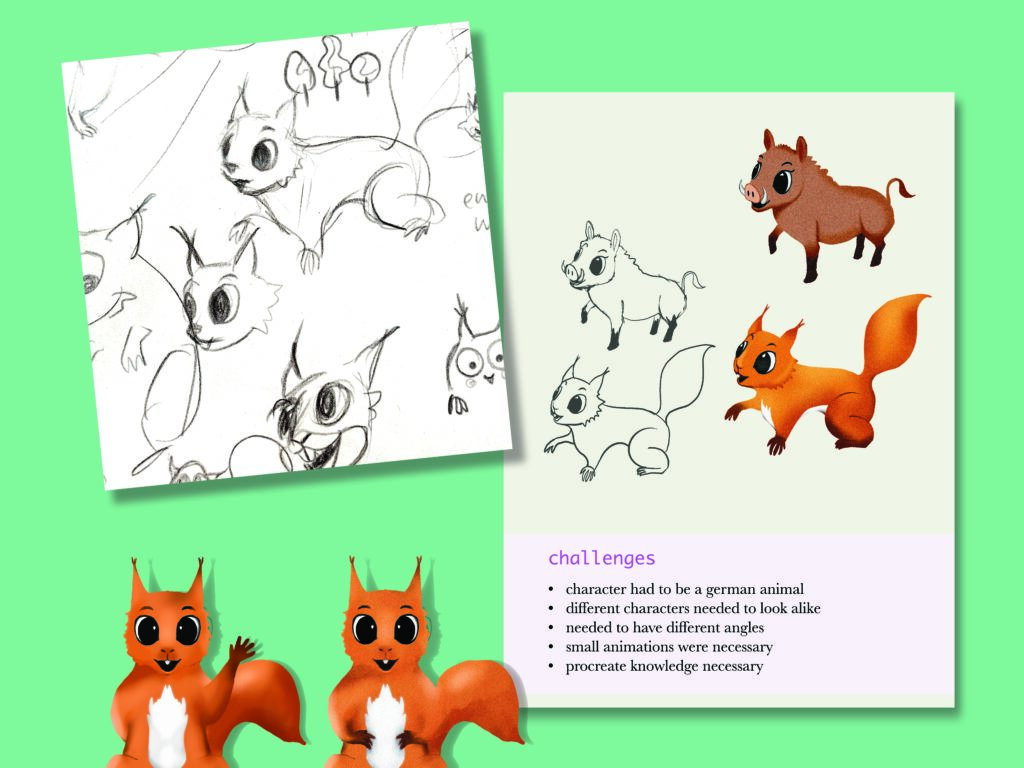
As UX Designer, I was responsible for the concept, development, and design of the “Discover Germany” app. I crafted a user experience tailored specifically to children aged 6-12. This required a shift in the design approach—focusing on visual storytelling, reducing text, and emphasizing character and landscape illustrations to captivate young users. By user journey mapping, I realized that understanding the unique needs of this young audience was critical. Developing detailed personas early on helped guide the design process. These personas, representing key user groups, gave me solid insights into user pain points and motivations, which shaped the app’s features.
Working with Figma, I became a big fan of components for seamless design changes. I conducted one-on-one interviews with parents to gather qualitative insights into their experiences during car trips. These insights guided me on how the app would be actually be used in various contexts, ensuring a user-friendly experience.
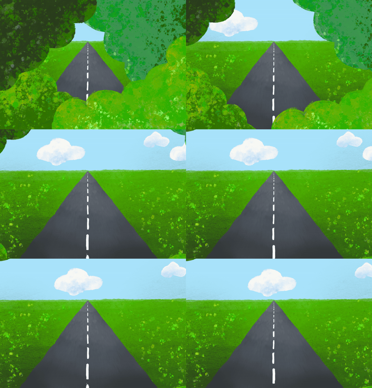
A high-fidelity interactive prototype designed in Figma, using Procreate to illustrate and animate some designs.
